Happy new year to all ! For this first post of 2017, let's dig in some techincal details on graphs in GCDkit, for those of you who would like to develop their own templates. Interested? Read on....
One of the beauties of GCDkit is the possibility to access many predefined diagrams of common use. They reside in the "plots/classification" or "plots/geotectonic" menus. The difference between the two types of diagrams is subtle; diagrams from "classification" can be used for to classify samples according to where they fall in the diagram, whereas those from the "geotectonic" group cannot be used in this way. In some cases it is rather obvious (some of the geotectonic diagrams actually include multiple panels, so the classification would be a bit more difficult). In other cases the difference is just a matter of how the function is written internally, and converting a geotectonic diagram to a classification diagram would be easy.
Template files reside (on a windows 7 install) in C:\Program Files\R\R-3.2.1\library\GCDkit\Diagrams\ . If you navigate there (or in the …\library\GCDkit directory in your R installation, if you did put R somewhere else, for some reason), you will notice 4 "spider" something files (which we are not going to consider for now); a classification directory; a geotectonic directory. The "classification" directory has 3 sub-directories for the 3 languages now supported. Each of the 3 language directories contains the same files, with just the names being translated. In fact the master directory is the English one, and the other two are automatically generated from a dictionary file (.dict.txt) during compilation – not something you'll have access to, so for the time being better stick to English.
Let's look at a diagram template in … \library\GCDkit\Diagrams\Classification\English . For instance a simple one, a Shand diagram. The corresponding file, Shand.r, can be opened in a text editor of your choice (notepad is by default on your computer but if you are serious about programming, you should look for one of the myriad of more clever alternatives – notepad++, ultraedit, winedt, tinn-R…). Shand.r is a 28-lines file, that we will now examine.
The first line reads
So we are defining a new function, named Shand(). The function takes no arguments. The curly brace { closes at the very end of the file, line 28, so all of the file is enclosed in the function.
Next are two lines:
Then comes the core of the graph function, the template. The template will be used by GCDkit's internal plotting system called "Figaro", which is a rather complex affair that allows interactions with the graphs. You do not really need to understand the specifics of it; all you need to know is that you have to supply an object called temp (for template, not temporary!) that will be a list containing all the stuff you'd like Figaro to plot on your diagram (in addition to the datapoints): lines, labels, etc.
Here, the template is assembled lines 21 to 25, with the following code:
First, we define the lines with
Both are then merged into temp, as we discussed; and the last thing to do is to call Figaro with
The Figaro object is one more list of lists, which you use to pass the graph template (template=temp, at the end) as well as parameters such as the plot limits (xlim, ylim), the title of the graph (main) and of the axes (xlab, ylab), etc.
The function that has just been defined (called Shand(), as you may remember) does nothing visible on its own. But it can be used as an argument to more interesting things such as
A non-classifying diagram is very similar – except that its template has no clssf object; and this allows to have open fields (remember how here the classification fields all have to loop back to the (x,y) of the first point…)
So
– we can now use our newly acquired knowledge to define a new diagram
template. Let's go for my old friend – Martin's La/Yb vs. Yb diagram for
TTGs vs non-TTGs. As you know this diagram has been seriously misused
and I suggest you read, for instance, Moyen (2009) and Moyen &
Martin (2012) before using it, but let's consider for the time being
that you know what you are doing, right ?
As shown here, this diagram has a closed blue "TTG" field to the left, but in other work it is actually left open to the top. Closing it does allow to use this diagram as a classification diagram, so let's keep it like that.
Let's create a new R file. It starts with:
We are using normalized values here, and not ppm. Also, we need to calculate a ratio (La/Yb)N, that is not available by default in WR, so we do the calculation ourselves.
Now for the template :
By the way don't forget to close the parenthesis here (see the final file).
Again, a closing curly brace is required here to close the function.
But you can still get it (and, presumably, debug it !) with
When you're happy with your diagram, it's time to drop it in the … \Diagrams\Classification\English folder, and load some data to see what happens (until you load data, nothing will happen, as GCDkit only searches for diagrams when loading data !).
Enjoy your new diagram !
The whole code in a single R file: click here.
One of the beauties of GCDkit is the possibility to access many predefined diagrams of common use. They reside in the "plots/classification" or "plots/geotectonic" menus. The difference between the two types of diagrams is subtle; diagrams from "classification" can be used for to classify samples according to where they fall in the diagram, whereas those from the "geotectonic" group cannot be used in this way. In some cases it is rather obvious (some of the geotectonic diagrams actually include multiple panels, so the classification would be a bit more difficult). In other cases the difference is just a matter of how the function is written internally, and converting a geotectonic diagram to a classification diagram would be easy.
Diagram templates
Let's start by having a look at how diagrams are defined in GCDkit. You may have noticed that, when you load data, GCDkit prints a list of diagrams that can be used – i.e. the program reads diagrams from files on the disk, and checks for each of them whether the required data exists for this dataset (technically, if WR[] has the appropriate column headings). So adding one diagram template is actually a simple matter of writing a template file.Template files reside (on a windows 7 install) in C:\Program Files\R\R-3.2.1\library\GCDkit\Diagrams\ . If you navigate there (or in the …\library\GCDkit directory in your R installation, if you did put R somewhere else, for some reason), you will notice 4 "spider" something files (which we are not going to consider for now); a classification directory; a geotectonic directory. The "classification" directory has 3 sub-directories for the 3 languages now supported. Each of the 3 language directories contains the same files, with just the names being translated. In fact the master directory is the English one, and the other two are automatically generated from a dictionary file (.dict.txt) during compilation – not something you'll have access to, so for the time being better stick to English.
Let's look at a diagram template in … \library\GCDkit\Diagrams\Classification\English . For instance a simple one, a Shand diagram. The corresponding file, Shand.r, can be opened in a text editor of your choice (notepad is by default on your computer but if you are serious about programming, you should look for one of the myriad of more clever alternatives – notepad++, ultraedit, winedt, tinn-R…). Shand.r is a 28-lines file, that we will now examine.
The first line reads
Shand<-function(){
So we are defining a new function, named Shand(). The function takes no arguments. The curly brace { closes at the very end of the file, line 28, so all of the file is enclosed in the function.
Next are two lines:
x.data<<-WR[,"A/CNK"]
y.data<<-WR[,"A/NK"]
Here the code defines two variables (vectors) called x.data and y.data; they are a subset of the matrix WR, specifically x.data gets the content of the column called "A/CNK" and y.data gets "A/NK". Both are calculated by GCDkit from your major elements data when loading a file, so you can trust they'll always be there – otherwise you would have to do the calculation yourself. Note that we use here a "super assignment", <<- , to make sure the variables are accessible even outside of the function (ok, you do not really need to understand that if you are just up to hacking some diagram templates).
Then comes the core of the graph function, the template. The template will be used by GCDkit's internal plotting system called "Figaro", which is a rather complex affair that allows interactions with the graphs. You do not really need to understand the specifics of it; all you need to know is that you have to supply an object called temp (for template, not temporary!) that will be a list containing all the stuff you'd like Figaro to plot on your diagram (in addition to the datapoints): lines, labels, etc.
Here, the template is assembled lines 21 to 25, with the following code:
if(getOption("gcd.plot.text")){
temp<-c(temp1,temp2)}
else{
temp<-temp1
}
Which looks at the value of the (Boolean) option
gcd.plot.text, and accordingly will either merge temp1 and temp2, or use
only temp1, to create the list temp. temp2, as you may have guessed,
contains the text labels as we shall see latter on.First, we define the lines with
temp1<-list(
clssf=list("NULL",use=2:5,rcname=c("metaluminous","peraluminous","peralkaline","undefined")),
lines1=list("lines",x=c(1,1,0.5,0.5,1),y=c(1,7,7,1,1)),
lines2=list("lines",x=c(1,2,2,1,1),y=c(1,1,7,7,1)),
lines3=list("lines",x=c(1,1,0.5,0.5,1),y=c(1,0,0,1,1)),
lines4=list("lines",x=c(1,2,2,1,1),y=c(1,1,0,0,1)),
lines11=list("abline",h=1,col=plt.col[2]),
lines12=list("abline",v=1,col=plt.col[2]),
lines13=list("lines",x=c(0,7),y=c(0,7),col=plt.col[2],lty="dashed"),
GCDkit=list("NULL",plot.type="binary",plot.position=14,plot.name="A/CNK - A/NK (Shand 1943)")
)
temp1 is a list of "things" to plot on the graph; each item in the list is a list itself. Here we define the following:- clssf, which contains the names to use for classification purposes. Here we indicate that the items to use for classification will be number 2 to 5 (number 1 is clssf itself), and the names to be used are, in the same order, "metaluminous"… etc.
- lines1 to lines4 are, as the first item of the list tell us, "lines". Their coordinates are given as a series of x values, then y values. So the first item, lines1, goes from (1,1) to (1,7) to (0.5,7) to (0.5,7) back to (1,1). Note that since it will be used for classification purpose, we must close it and return to the origin – hence the first and last points are the same. Also note that these lines have neither color nor pattern, so they will be plotted but invisible (you may, however, encounter them if you edit the resulting graphical file in Illustrator or similar, as you will get these surprising invisible polygons – yes, that's why!
- lines11 and lines12 are "abline", the first one is horizontal at y=1 (h=1), the second one is vertical. Both are plotted in colour #2 (which has been defined somewhere else).
- lines13 is a dashed line, defined as a "lines" Figaro object with x and y values.
- GCDkit is a list of type "NULL" (it's not a type known to Figaro), but contains the info GCDkit needs to add it to the menu: the name under which it will appear (plot.name = ) and the position it will assume in the list of graphs (plot.position=14).
temp2<-list(
text1=list("text",x=0.55,y=6,text="Metaluminous",col=plt.col[2],adj=0),
text2=list("text",x=1.05,y=6,text="Peraluminous",col=plt.col[2],adj=0),
text3=list("text",x=0.55,y=0.5,text="Peralkaline",col=plt.col[2],adj=0)
)
As you can see, these are the text labels to draw. All are of
type "text", and come with a plotting position, a text, colour, and adj
(how the text will be "aligned" around its nominal position).Both are then merged into temp, as we discussed; and the last thing to do is to call Figaro with
sheet<<-list(demo=list(fun="plot", call=list(xlim=c(0.5,1.5),ylim=c(0,7),main=annotate("A/CNK-A/NK plot (Shand 1943)"),col="green",bg="transparent",fg="black",xlab="A/CNK",ylab="A/NK",main=""),template=temp))
(or
in fact, to put all the info in a figaro object, that is actually drawn
when calling the function plotDiagram, which is what the GUI does).The Figaro object is one more list of lists, which you use to pass the graph template (template=temp, at the end) as well as parameters such as the plot limits (xlim, ylim), the title of the graph (main) and of the axes (xlab, ylab), etc.
The function that has just been defined (called Shand(), as you may remember) does nothing visible on its own. But it can be used as an argument to more interesting things such as
plotDiagram(diagram="Shand") # asks lots of questions, and eventually plots the diagram
orclassify(diagram="Shand") # writes the classification of each sample
and these are the functions used in the GUI.A non-classifying diagram is very similar – except that its template has no clssf object; and this allows to have open fields (remember how here the classification fields all have to loop back to the (x,y) of the first point…)
Our own new diagram
 |
| La/Yb vs. Yb diagram (here from Moyen and Martin 2012 |
As shown here, this diagram has a closed blue "TTG" field to the left, but in other work it is actually left open to the top. Closing it does allow to use this diagram as a classification diagram, so let's keep it like that.
Let's create a new R file. It starts with:
LaYb<-function() # The name of the function. {
x.data<<-WR[,"Yb"]/0.22
y.data<<-(WR[,"La"]/0.33)/(WR[,"Yb"]/0.22)
We are using normalized values here, and not ppm. Also, we need to calculate a ratio (La/Yb)N, that is not available by default in WR, so we do the calculation ourselves.
Now for the template :
temp1<-list(
clssf=list("NULL",use=2:3,rcname=c("TTG/adakite","ordinary")),
only two classification items – if we are somewhere else, "classify" will return the value "unclassified".lines1=list("lines",x=c(0.28,1.55,2.55,5.3,8.6,8.6,3,1,0.28,0.28),y=c(150,150,70,40,25,5,5,15,35,150),col=plt.col[2]),
lines2=list("lines",x=c(4.5,4.5,20,20,4.5),y=c(2,30,10,2,2),col=plt.col[2]),
The
two polygons (TTG for the first one, ordinary calc-alkaline for the
second one). The most time consuming part is actually extracting
coordinated from the diagram. Here I did it by reading the cursor
coordinates in Illustrator… Also, we need not forget to define the
colour (colour number 2 here, the common GCDkit brown by default)
otherwise the polygons will be invisible.GCDkit=list("NULL",plot.type="binary",plot.position=100,plot.name="La/Yb vs. Yb (Martin, 1986)")
Position
in the list of available GCD graphs. I put it at 100 to be (reasonably)
sure it does not interfere with anything else. If I define more
diagrams, I'll make them 101, 102, etc.By the way don't forget to close the parenthesis here (see the final file).
temp2<-list(
text1=list("text",x=2.5,y=100,text="TTG/adakite",col=plt.col[2],adj=0),
text2=list("text",x=14,y=22,text="ordinary",col=plt.col[2],adj=0)
)
The text annotations. A bit of trial and error is required to get good-looking (x,y) coordinates.if(getOption("gcd.plot.text")){
temp<-c(temp1,temp2)}
else{
temp<-temp1
}
This stays the same as in Sand's example before, I like the idea of a global option
defining whether to annotate the diagram or not (plus, I think the
un-annotated versions are used in plates).sheet<<-list(
demo=list(
fun="plot",
call=list(
xlim=c(0,24),
ylim=c(0,175),
main=annotate("La/Yb vs. Yb (Martin, 1986)"),
col="green",
bg="transparent",
fg="black",
xlab=annotate("Yb[N]"),
ylab=annotate(("(La/Yb)[N]")),
main=""
),
template=temp
)
)
And the actual Figaro call (here reformatted because I
was getting lost in all the parentheses, now you can see what's going
on !). Note the use of annotate and square brackets to get subscripts.Again, a closing curly brace is required here to close the function.
Using it !
Now, you can test your diagram. The easiest is to "manually" load the function, maybe by "sourcing" its code (from file/source R code in the GUI, or by using source("path\\to\\file\\LaYb.r") from the command line) or even by copy/paste to the console. Of course your diagram will not show in the menus (it has not been loaded yet).But you can still get it (and, presumably, debug it !) with
plotDiagram(diagram="LaYb")
and the classificationclassify(diagram="LaYb",silent=TRUE)
(we
need silent=TRUE otherwise GCDkit tries to look into the list of known
diagrams to retrieve its name – which, of course, fails miserably since
the diagram has not been properly loaded yet). |
| The "classification" menu after adding the diagram in the right directory |
When you're happy with your diagram, it's time to drop it in the … \Diagrams\Classification\English folder, and load some data to see what happens (until you load data, nothing will happen, as GCDkit only searches for diagrams when loading data !).
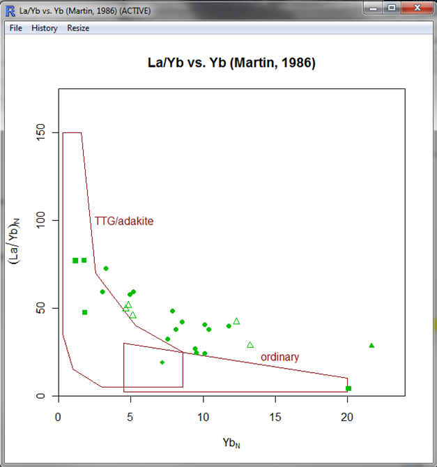 | ||
| The diagram in GCDkit. Yes, some rocks are not adakites. Even if they have high La/Yb. |
Enjoy your new diagram !
The whole code in a single R file: click here.
NANUM 명품 그래프게임 그래프사이트 부스타빗소셜그래프 추천 가장 완벽하게 그래프사이트를 운영하는 곳을 추천합니다 소셜그래프게임에 대한 안전성을 확실히 해결한 그래프사이트입니다 부스타빗을 조작 없이 즐길 수 있는 메이저사이트로 초대합니다 여기를 클릭하십시오 그래프게임
ReplyDeleteThis comment has been removed by the author.
ReplyDeleteThis comment has been removed by the author.
ReplyDeleteI appericiate your work it help me alot. Your Blog is my favorite. Please visit my site for ieee gsm projects projects. If anyone needs best project visit our website
ReplyDeleteFon Perde Modelleri
ReplyDeletesms onay
mobil ödeme bozdurma
Https://nftnasilalinir.com
ANKARA EVDEN EVE NAKLİYAT
Trafik Sigortası
Dedektör
web sitesi kurma
aşk kitapları
smm panel
ReplyDeletesmm panel
İş ilanları
İnstagram takipçi satın al
hirdavatci burada
HTTPS://WWW.BEYAZESYATEKNİKSERVİSİ.COM.TR/
servis
tiktok jeton hilesi
Congratulations on your article, it was very helpful and successful. ebdb88da1d78254fcb1a57dae7e0536f
ReplyDeletenumara onay
website kurma
website kurma
Thank you for your explanation, very good content. 6d19aeab5e7a6f85f3b471a2633ab898
ReplyDeletedefine dedektörü
Good content. You write beautiful things.
ReplyDeletehacklink
taksi
sportsbet
mrbahis
korsan taksi
hacklink
mrbahis
vbet
vbet
Good text Write good content success. Thank you
ReplyDeletebonus veren siteler
betmatik
kralbet
slot siteleri
poker siteleri
kibris bahis siteleri
mobil ödeme bahis
betpark
sultangazi
ReplyDeleteordu
mardin
bodrum
sincan
ND16
https://saglamproxy.com
ReplyDeletemetin2 proxy
proxy satın al
knight online proxy
mobil proxy satın al
73BCG4
Nice Blog...Thanks for sharing..
ReplyDeleteBest Embedded training in Chennai| placement Assurance in Written Agreement